

Paint color is an essential part of a home for everyone—whether you faithfully watch out for the new Color of the Year announcements or you’re just searching for new ways to refresh a space. However, you don’t have to be limited to one color when redecorating your home; there are many wonderful hues that deliver impact and elegance.
Here, to encourage you to step outside of a set color palette, we spoke to interior designers about their favorite shade—and want to see more of—in 2025. From a calming sage to a versatile chocolate gray, this list will inspire you to rethink that spring makeover.
Vintage Vogue by Benjamin Moore
Benjamin Moore
If you’re a fan of color-drenching, this is the shade for you. Interior designer Galey Alix loves to bring Vintage Vogue into kitchens or libraries with floor-to-ceiling shelving—doing so really brings the millwork to life.
“In the evening, it still pulls green and doesn’t camouflage into black or slate, while in daylight, it maintains its depth, which I find most dark greens fail to,” she says.
Gloucester Sage by Benjamin Moore
Benjamin Moore
For those who lean towards soothing earth tones, Alix suggests adding Gloucester Sage to smaller rooms, like powder baths and breakfast nooks.
“It’s bold with a side of demure,” she says. “This is one of those mossy greens that can instantly elevate whatever it touches. I especially like that it’s one of the few medium sage tones that doesn’t pull too gray in different lighting.”
There’s also something vintage and traditional about it, which makes it incredibly versatile.
India Yellow by Farrow & Ball
MDI Luxury Design / Julia Lynn Photography
Want to try a slightly bolder hue? Mikala Kuchere, lead designer of MDI Luxury Design, suggests India Yellow.
“It has range, with earthy undertones, and can be quite sophisticated and serve nicely as a grounding layer,” she says. “It can also add a pop of color to a space. I recently used it on a cabinet in a client’s laundry room with a fun, vibrant wallcovering.”
Wellfleet by Portola Paints
Brigette Romanek and Estee Stanley, The Great on Melrose / Portola Paints
“Color drenching is set to be a major trend in 2025, and Wellfleet is the perfect shade to embrace it,” says interior designer Jessica Nicastro. “I love this blue because it strikes a balance between depth and warmth.”
If you were drawn to Mocha Mousse, Nicastro suggests pairing Wellfleet with the hue—its rich, cool undertones complement the warm, earthy tone perfectly.
Barnwood by Benjamin Moore
Benjamin Moore
Never underestimate the power of a warm gray. “We love this Benjamin Moore color—it’s a deep gray with hints of brown, making it super versatile, moody, and perfect for rooms like bars and dining rooms,” says interior designer Emily Rand.
Pure White by Sherwin-Williams
Galey Alix Design
Everyone needs a shade of white to keep in their back pocket. Galey Alix suggests Pure White by Sherwin-Williams as a go-to. It’s an especially relevant hue now in light of recent trends.
“Amidst the craze of color-drenching and jewel tones, I’ve found it’s the only white that doesn’t pull yellow, pink, blue, or gray in any lighting,” she says. Incorporating white walls and decorative accents is still important, after all—even in a world of vibrant color.
Havana Affair by Alkemis
ML Jacobson Design / Alkemis
“My favorite color lately is Havana Affair—a bright, rusty, orange-red,” says Michelle Jacobson, founder of ML Jacobson Design. “I try to incorporate it into every project because it has just the right amount of pizazz to spark daily joy.”
Jacobson recently used the bold, rich color in a powder room, citing its “rich, matte velvet finish” as akin to the “inside of a jewelry box.” “No one knows what to expect for 2025,” she adds. “Havana Affair offers warmth and comfort to ease anxiety.”
Swiss Coffee by Benjamin Moore
Phoebe Beachner
Swiss Coffee is a warm, refined neutral that feels effortlessly inviting. “Its soft undertones enhance natural wood and brass metal finishes, creating a timeless, harmonious backdrop for living spaces,” says interior designer Phoebe Beachner.
Additionally, when used in a kitchen, it provides a foundation that allows other design elements—like statement lighting or bold accents—to shine. “In 2025, I’d love to see more designers embrace its understated elegance,” she adds.
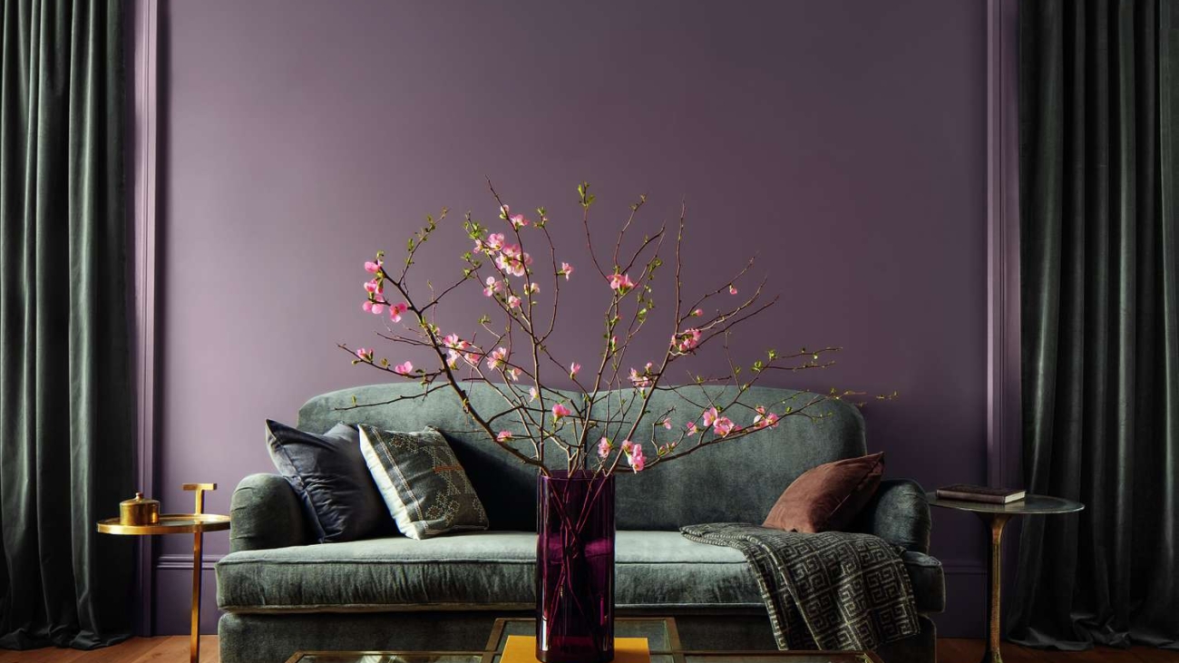
Cinnamon Slate by Benjamin Moore
Courtesy of Benjamin Moore
What better hue is there to try than Benjamin Moore’s Color of the Year for 2025? “Cinnamon Slate is a rich, moody blend of deep plum and earth brown,” says Vyanca Soto, the principal designer of Market Studio Interiors. “It’s warm, enveloping, and undeniably sophisticated.”
The beautiful color also represents a move towards colors that feel grounded, confident, and full of character—a trend Soto hopes to see more of this year. “It creates instant depth without feeling heavy, making any space feel refined yet inviting,” he adds.
Grand Canyon by Benjamin Moore
Phoebe Beachner
Grand Canyon is a rich, dynamic hue that exudes warmth and depth. “Its earthy sophistication pairs beautifully with deep blues and greens, adding a sense of adventure without overpowering a space,” says Beachner. “I’d love to see this color used more in 2025 to create interiors that feel bold yet beautifully balanced.”
It will feel right at home with soft lighting, organic textures, and natural stone.
Alabaster by Benjamin Moore
Leah Bailey Interiors / Kelli Boyd Photography
“Alabaster is my ultimate go-to,” says interior designer Leah Bailey. “It’s soft, sophisticated, and instantly elevates any space. I can’t get enough, and I want to see even more of it in 2025!” Pure elegance in a color? We’re sold.
Revere Pewter by Benjamin Moore
Byrnes Design Studio
Isabel Byrnes, the founder of Byrnes Design Studio NY, wants to see more of Revere Pewter this year, as it’s perfect for layering trendy colors like deep brown, purple, and ruby red via accessories.
“It’s one of my favorite paint colors because it adds incredible warmth to a space without feeling overwhelming,” she says. “It’s a light gray, with soft, green-gray undertones; it has a cozy yet sophisticated feel that works in so many different settings.”
Revere Pewter is also incredibly versatile. Byrnes uses it as the sole color for bedrooms, in kitchens, and even as a trim.
Antique Pearl by Benjamin Moore
Asler Valero
“I adore Antique Pearl—it’s a soothing, muted silver-lilac,” says interior designer Asler Valero. “In daylight, the lilac undertones shine, while at night, it transforms into a warm, happy gray.”
Its versatile nature makes it incredibly flexible, complementing both cool and warm colors. To achieve an aged, textured look in a space, Valero applies the eye-catching hue with a sponge.
Buxton Blue by Benjamin Moore
Phoebe Beachner
In need of a coastal escape? Beachner suggests Buxton Blue by Benjamin Moore. “It’s a serene, atmospheric blue reminiscent of clear skies and open horizons,” she says. “Buxton Blue’s versatility allows it to complement both warm and cool finishes. It’s a perfect choice for tranquil yet expressive interiors.” Add this to a room, and you’ll be staycation-ready.
Heron Plume by Sherwin-Williams
Arlene Angard
For those looking to makeover a kitchen, Heron Plume by Sherwin-Williams is the perfect color. “What truly resonates is how this soft, warm cream acts as a constant, welcoming presence in the kitchen,” says interior designer Arlene Angard.
It also provides a versatile foundation for future kitchen makeovers and designs. Angard describes its “nuanced tonal values of warm cream and gray” as an opportunity to create a “soft, modern” space.
Add a Comment