
Chalk paint is perfect for DIY projects, whether you’re reviving a secondhand headboard from the thrift store or upgrading worn-down walls. The big perk? Unlike regular paint, chalk paint doesn’t require sanding, priming, or a topcoat, so you’ll get a stunning matte finish that lasts for years—with minimal effort.
This type of paint was originally created by artist Annie Sloan in 1990; today, her eponymous brand carries a bevy of these beautiful, durable colors. To help you narrow your search, we spoke to Sloan and other interior designers about the very best of these paint colors. Follow these suggestions, and you’ll be able to tackle your next home project with ease.
Napoleonic Blue
Anthony Gianacakos
If you want a statement-making design, then look no further than Annie Sloan’s bold, graphic Napoleonic Blue.
“Most people use it on furniture, but I used it on my walls, kitchen cabinets, and even the counters,” says designer Anthony Gianacakos, founder of Anthony George Home. “When I painted the counters, I used several layers of poly on top to seal it in and make it more durable.”
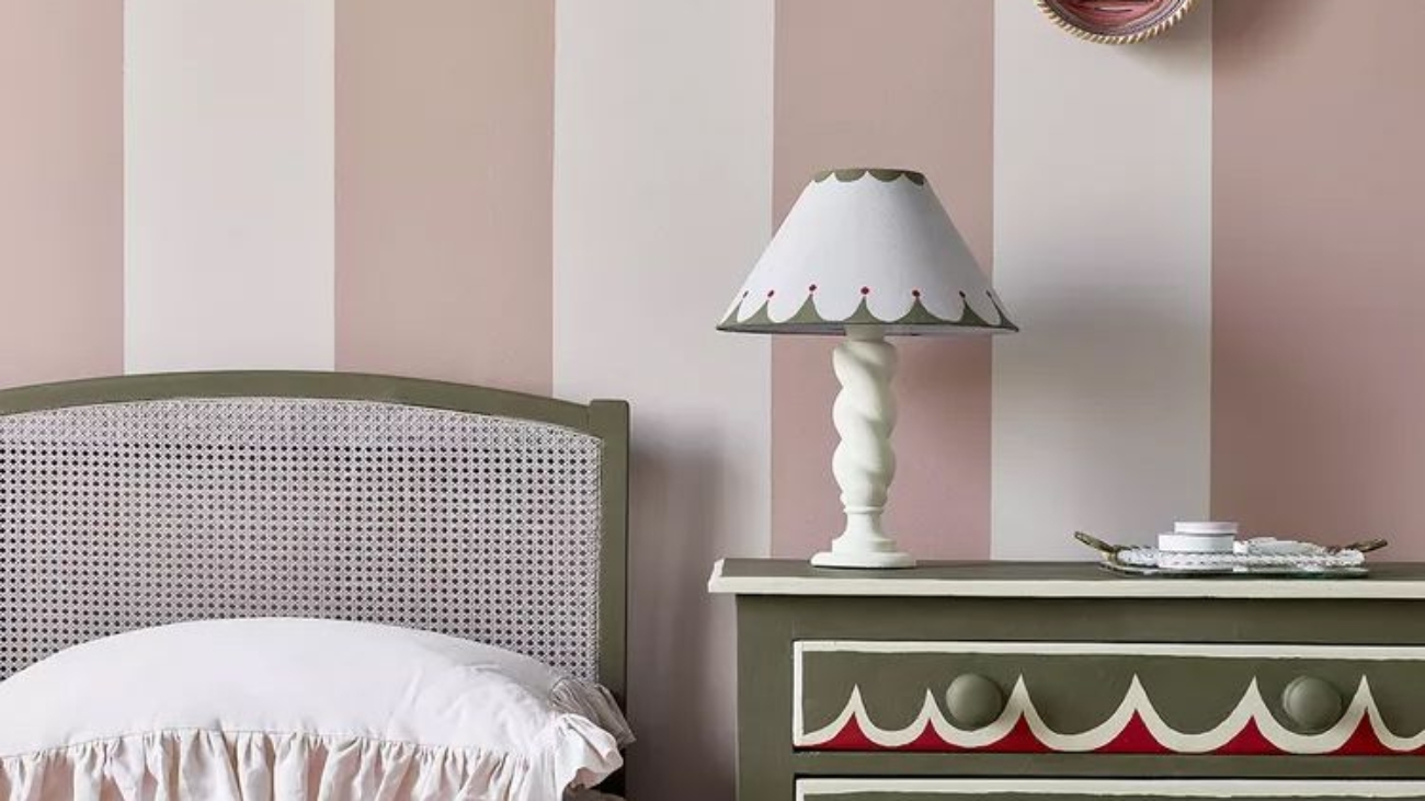
Olive
Annie Sloan
On the hunt for a unique earth tone? “Olive is the chameleon of the chalk paint palette,” says Sloan. “It’s a soft, traditional khaki green that will create a sense of space in a small kitchen. It can be a neutral, dropping into the background, or it can be the shining star of a color scheme.”
Louis Blue
Annie Sloan
When it comes to chalk paint, almost any surface is fair game. Here, Sloan used Louis Blue on the walls behind a mirror and vanity. “It’s great for glass, metal, flooring, concrete, and plastic,” she says. “When I invented chalk paint, I needed it to be no fuss—quick to apply and quick to dry.”
Old Violet
Annie Sloan
Instead of retiling a bathroom, you can follow a simple pattern with chalk paint. “Use it on the sides of baths, on floors, or furniture—you just need to seal in with clear lacquer,” says Sloan. “Here, we used Old Violet to create a checkerboard effect on the floor. It’s a simple technique that adds drama to a space.”
The color, she says, was inspired by the purple found in 18th-century interiors. It’s “pretty yet impactful” and pairs well with whites, as well as more contrasting colors, like red or deep pink.
Paloma
Annie Sloan
Gone are the days of boring wooden drawers. According to Sloan, while these pieces are beautiful and well-made, materials like natural pine tend to turn orange with age. Instead, she painted this particular cabinet with chalk paint in the color Paloma.
“It gives a really pretty, contemporary look to the piece, especially when we changed the boring pine knobs for these stylish ones from Matilda Goad,” she says.
Frida Blue
Annie Sloan
Layering or stenciling a design with chalk paint can completely change a standard piece of furniture. “Let your creative juices flow,” says Sloan. “This rather boring cabinet was transformed with my Frida Blue paint, turning the piece into a work of art.”
Paprika Red
Annie Sloan
Paprika Red is a beautiful pop of color that can complete a room—without feeling too over the top. Here, Sloan used it on the ornate sideboard. “It’s a strong color, but because it has earthy pigments in it, it’s soft and elegant,” she says. “I find it’s a wonderfully versatile shade.”
Coolabah Green
Annie Sloan
An earthy green makes for a lovely neutral, but you can take it to the next level by pairing it with brighter hues. Here, Sloan contrasted the soft, elegant Coolabah Green with a bright red.
“I love to scour flea markets and thrift shops for pieces to paint,” she adds. “Don’t worry too much about scratches or stains—you can always paint over them.”
French Linen
Thomas Mach Interiors
“French Linen is the perfect color for tables, lamps, flower pots, and tables,” says interior designer Thomas Mach. Its perfect blend of gray and soft purple undertones gives it a cool, effortlessly stylish look.
Here, Mach used the Annie Sloan color on an old baby changing table, which he transformed into a cocktail bar for his home.
Capri Pink
Joyelle West Photography
When using chalk paint, don’t be afraid to go bold. In this bathroom, Stacey Martin, founder of interior design firm the Freshmaker, used Capri Pink on a pair of shell-shaped sconces. “Their creamy, saturated hues are just the trick when adding an unexpected pop of personality to a light fixture or mirror,” she says.
Athenian Black
Joyelle West Photography
Black is a versatile neutral, but it can look stark in certain interior design schemes. To help soften the look, add texture with chalk paint. Here, Martin used Athenian Black to create a layered, artistic wall.
“Using a rag and dry brush techniques, I applied black chalk paint swirls over matte black latex paint for a textural, two-tone effect,” she says.
Oxford Navy
Eva Bradley Studio
Darker tones, like Oxford Navy, can look both bold and high-end. Here, interior designer Eva Bradley used the hue on the walls of a home office.
“I love using chalk paint in spaces where I want to add depth, texture, and a sense of luxury,” she says. “My go-to shades are darker hues because they really bring out the dry, plaster-like quality of the finish.”
Source link
Add a Comment